Labels restyling
We loved our label born in 2009 from the desire to tell our values in a single image, family home, vineyards immersed in the woodland, wine as a moment of pleasure and sharing, but in recent years we have grown and the VILLA SAN CARLO project has evolved, day after day our identity has become more defined and stronger. While maintaining our roots firmly in the territory and tradition, we felt the need to express this change also on a graphic and iconographic level, to give our wines a more contemporary matrix, a mirror of our philosophy. Producing wine with innovation and elegance in respect of an identity born from the history and beauty of an exceptional place.
We have worked to identify the best expressions of each of the more than thirty parcels which, nestled on our hill, draw a refined embroidery featuring our true wealth. By studying the variations in the soil, the effects of the diversity of altitude and exposure, we have identified those fruits which, with their unique varietal characteristics, would have best interpreted each individual wine. And then the conversion to organic, the evolution of the agronomic approach, teamwork, attention to sustainability, the search for the best materials in the cellar are our growth parameters.
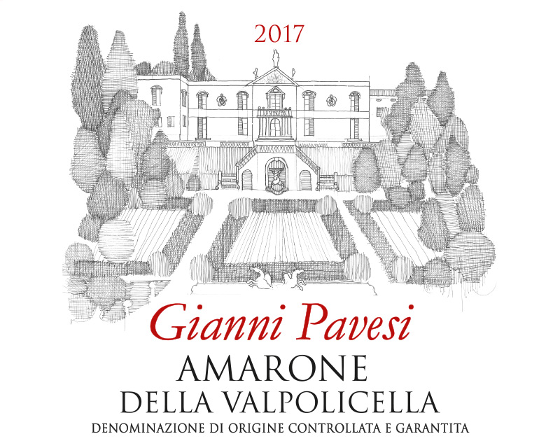
Thus was born the idea of a real restyling to tell how we have changed, a reinterpretation that we have entrusted to the signature of the wine label designer Federica Cecchi, for 20 years an “artisan” of the communication of wineries around the world. To take care of this new look, Federica immersed herself in our reality, transforming it into a story made up of details and elements of our history. If for the IGT wines, Capitel Alto and Metronis, and the Amarone Riserva we took inspiration from the house heritage for the DOC line, the skilful free hand of Tommaso Chini was chosen, a draftsman with an essential but detailed, sincere and at the same time poetic. An elegant china profile offers a bird’s-eye view of our hillside with the representative vineyards from which each individual wine comes to life.
Enlarging the size, the label has become brighter, embellished with a precious paper on which the lightened elements stand out, making it essential and with a strong emotional impact.
We tell the story, we are attentive to the present and we speak to the future.
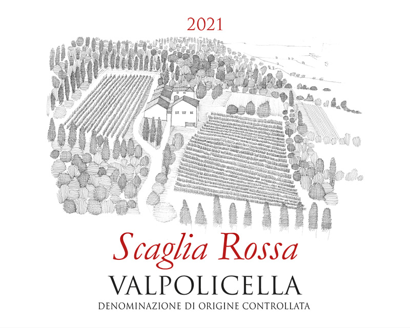
This image, with the cellar in the centre, reproduces the vineyards almost at the top of the hill where the mesoclimate is characterized by constant ventilation and significant high day/night excursions. Here the Valpolicella Scaglia Rossa is born, whose name recalls the color of the main component of these lands, a red marly limestone rich in iron oxides and fossils that gives freshness and floral aromas.
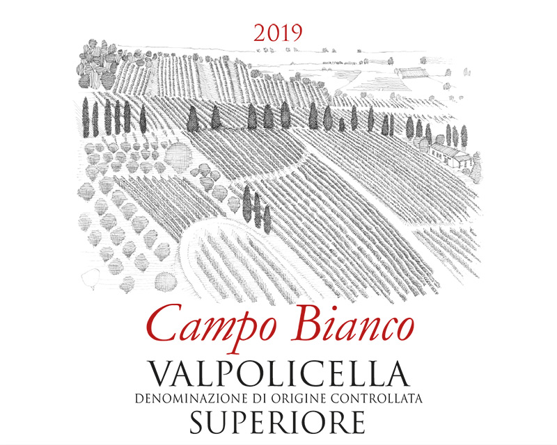
Valpolicella Superiore is obtained from the selection of the best grapes from the Campo Bianco vineyard, a highly suitable piedmont parcel thanks to a predominantly calcareous soil and perfect exposure which gives the bunches an ideal concentration and mineral notes.
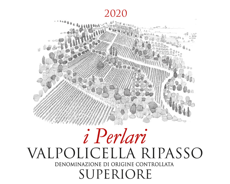
The Perlare tree, Celtis australis, also called stonebreaker or pearl tree is a spontaneous plant typical of our area. Imposing and robust, it characterizes the woodland that encloses the vineyards from which we select the grapes for Valpolicella Ripasso and becomes its emblem.
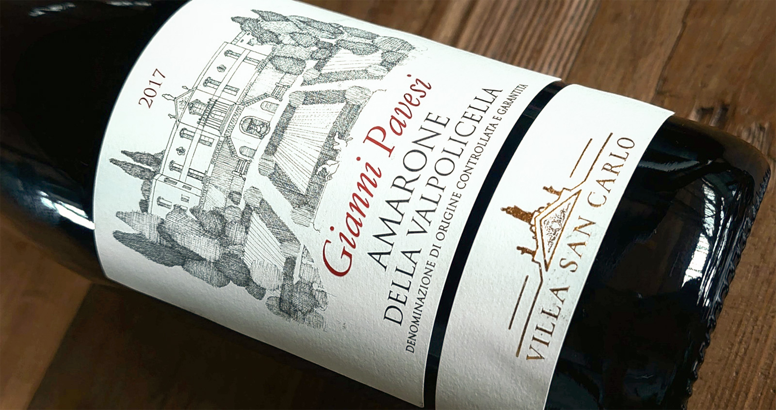
We dedicate Amarone to our father. His was the intuition of recognizing the potential for quality viticulture in this land, his was the initiative to enhance it with new plants, his was the challenge of the first vinification and the Villa San Carlo project. Thank you Dad.